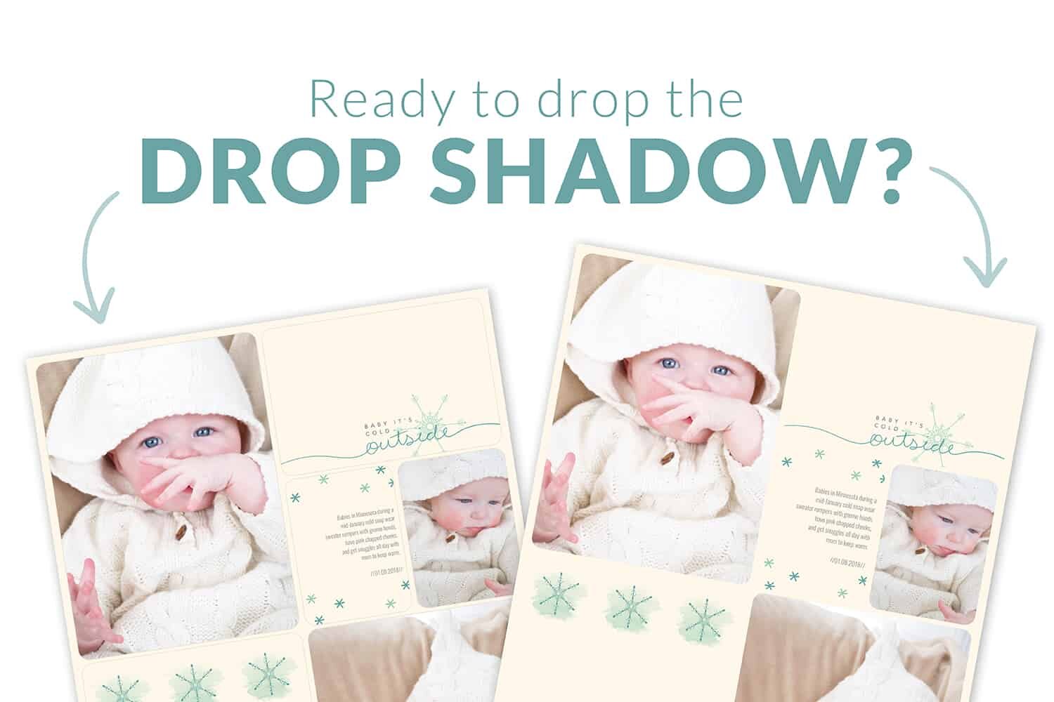
drop the drop shadow
In the November 2017 Project Life® App update, we introduced the ability to set your preferences. Among the settings to choose from is the ability to turn your drop shadows on and off. What exactly is a drop shadow? It is a digital effect given to the pocket on a layout to make them look 3-dimensional. It makes the pocket appear to be layered on top of your background page.
Over the years, we have had many customers experiment with the look of a solid color pocket on top of the same solid colored background to create a more traditional looking scrapbook layout. The problem? The drop shadows still gave the appearance of pockets on the layout. We listened to your feedback (because we love you, of course!) and now you have the option of turning drop shadows off and on in the Project Life App. This opens up a whole new world of possibilities when it comes to memory keeping with the app.
Meagan Johnson on our Project Life App Creative Team is LOVING the ability to turn off drop shadows in her app. She is providing some great instructions and examples of pages with the drop shadow turned off. I think you will love what she (and others) have created using this feature in the Project Life App.
Hey friends! My name is Meagan Johnson. I am a member of the Project Life App Creative Team (still pinching myself). I was asked to go into depth about a change in the app that came along with the update this past November. Along with the awesome Comfort and Joy Card Collection (which I couldn’t get enough this holiday season!), we were also given the option to turn the drop shadow on and off.
The purpose of a drop shadow is to make the object appear to pop off the page so the overall design looks more real. In the app, you barely know it’s there, but maybe you noticed it when you placed a light colored card onto a light colored background. You can see the Pocket Drop Shadows (PDS from here on) in this example:
Hello December 2015 Edition, Big Shot 7, PDS on
The thin gray lines are very subtle, but you can see the definition of each pocket and the slight dimension that the PDS adds to the page.
I zoomed in on the page so you can see it around the pictures too:

So now that we can make those thin gray lines go away, what does that mean as we create our pages? Oh, so many good things!
First, here is a quick step-by-step on how to turn the PDS option on and off:
1. On the Project Life App home screen, press the question mark in the green quadrant

2. Next Select Preferences

3. Turn the Pocket Drop Shadow option on or off
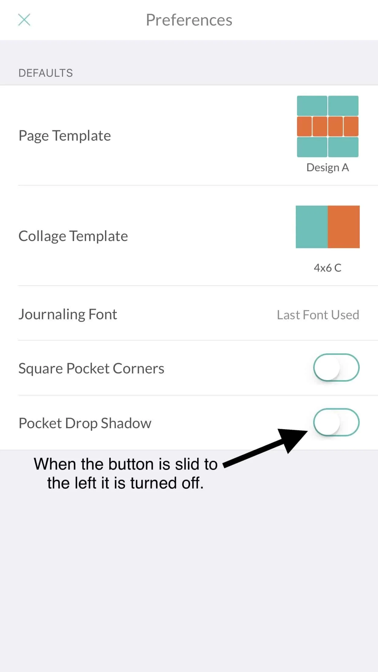
ONE CRUCIAL THING TO UNDERSTAND:
You must have your selection in Preferences made BEFORE you start your new page. You can’t turn it on or off mid-page (like you can the square or rounded corner option).
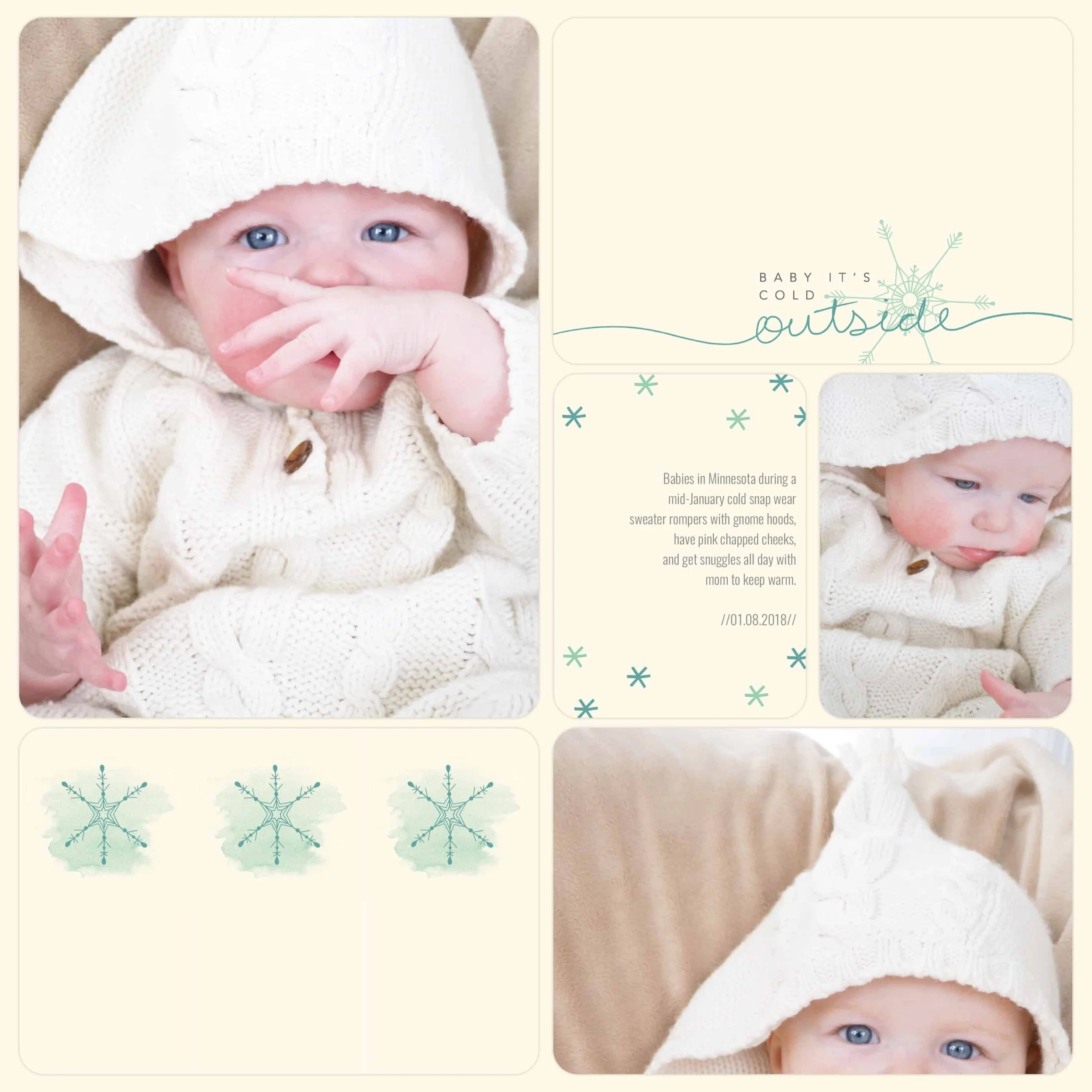
So that first page I showed you? Here it is with the PDS turned off:

Hello December 2015 Edition (retired), Big Shot 7 Template, PDS off
The page elements now look more connected. Your eye doesn’t break the page up into individual pockets but sees it as a whole. Kinda cool, huh?!
Turning off the PDS opens up a new design avenue that wasn’t available in the app prior to last December. I, of course, absolutely LOVE the classic pocket system, but as a traditional scrapbooker at heart, I also love having the option to flex my creative muscles sometimes.
There are several ways to utilize this option. The most simple is to just turn your PDS off and create pages as you normally do. A page might look something like this:

Project 52 Rad Edition, Design A Template, PDS off
As opposed to when it’s on:

Project 52 Rad Edition, Design A Template, PDS on
The change is really subtle and there is no right way to create your pages. It’s a personal preference thing just like everything else you choose to do with the app!
Sometimes, however, I really don’t want those gray lines at all! I know there are several app users who have wished they would just disappear at times too. Now they can!
Here are a couple more pages to show various looks. It’s very versatile!
This page is made with blank journaling cards and the background color to match:

Cat Themed Cards, Just Add Color Overlays, Design A Template, PDS off
Another option is to play with patterned cards that can give a repeated look:

Moments Like These, Design A Template, PDS off

Everyday Adventure Edition, Design A Template, PDS off
My favorite look has come from messing around with the Squared Away templates:

Oh What Fun Winter Value Kit, Squared Away 5 Template, PDS off

Boy Themed Cards, Just Add Color Overlays, Squared Away 7 Template, PDS off
I am definitely not the only person who has dabbled in the no PDS world. Check out these pages by other app users:
This page is by Pam Dowell of Oregon City, Oregon. Isn’t it absolutely lovely?! I love her use of overlays.

Squared Away 5 Template, Currently Edition, Essential Overlays White, Neutral Cards, PDS off
Wendy Cardno from Whitley Bay, England created this page:

Cinnamon Edition, Squared Away 16 Template, PDS off
And I love this Big Shot photo from Jessica Dent (insta account @jess_jeanette) in Darwin, Australia:

Documenting Disasters Edition, Big Shot 13 Template, PDS off
And the last one is from Meghan Guilmette from Portland, Connecticut:

Seasonal Snapshot 2015 (retired), Big Shot Template 31 Template, Just Add Color Overlays, and Explore Edition Overlays, PDS off
I hope you are inspired. If you get a creative itch, try it out! A big thanks to the Project Life team for having the insight to give us this option. It adds just the variety I needed. I can’t wait to see the overall difference when I print my 2018 book!